Resources for data visualization at Lehigh.
Visual Resources Library Guide
This library guide for finding, creating, and using visual elements in academic projects and includes information for getting started with Tableau and ArcGIS Online, both of which can be used for advanced visualizations of data.
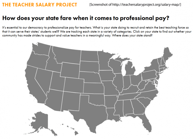
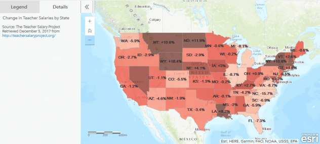
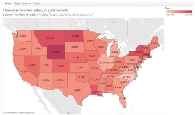
Here is an example comparing data as presented by the original source organization (The Teacher Salary Project) and how that data could be visualized in other ways using ArcGIS Online and Tableau:
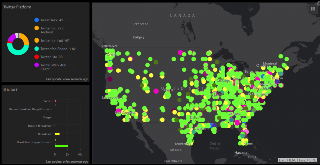
Another demonstration of data visualizations using these tools, presents data gathered using the Twitter API to track tweets using the #IHOb hashtag, which was part of a June 2018 marketing campaign by IHOP to announce the introduction of burgers to their menu. The company announced it would be “flipping” the “P” in their name to a “b” on June 4th, but did not reveal what the “b” stood for until June 11th. The following visualizations present Twitter users guesses at what the “b” could stand for using the data dashboards available in ArcGIS Online and Tableau.